Pick up any color wheel and stare at it long enough, and it starts to feel like a puzzle. Why does yellow next to purple feel so electric? Why does mixing red and green produce brown instead of something vibrant? These questions aren’t just philosophical — they have real, practical answers rooted in color theory, one of the most foundational concepts in visual art. Whether you’re just starting out with watercolors or refining your digital illustration skills, understanding how colors interact can completely transform the way you create.
Color theory is the body of knowledge that explains how humans perceive color, how colors mix, and how they can be combined to create specific visual effects. It draws from science, psychology, and centuries of artistic experimentation. And while it can get surprisingly deep, the core ideas are accessible to anyone willing to spend a little time learning them.
What Is Color Theory in Simple Terms?
At its most basic, color theory is a set of guidelines that help artists understand and use color effectively. It encompasses everything from the relationships between primary, secondary, and tertiary colors, to how warm and cool tones behave next to each other, to why certain color combinations feel calming while others feel energizing.
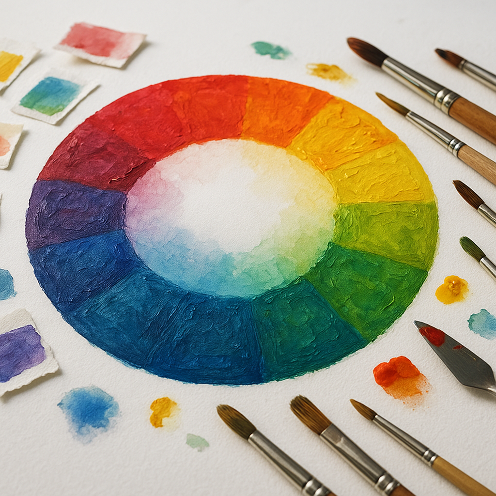
The foundation of traditional color theory is the color wheel, first developed by Sir Isaac Newton in 1666 when he bent white light through a prism and observed the visible spectrum. Since then, artists and scientists alike have built on that discovery to develop a rich framework for working with color.
In practical terms, understanding color theory helps artists:
- Mix colors more accurately and predictably
- Create a sense of mood and atmosphere in their work
- Build visual harmony or intentional contrast
- Communicate emotion without relying solely on subject matter
- Solve problems when a painting or design “just doesn’t look right”
The Building Blocks: How to Understand Color Theory in Art
Before diving into more advanced concepts, it helps to get comfortable with the basic vocabulary of color theory. These are the terms and ideas that everything else builds on.
Primary, Secondary, and Tertiary Colors
In traditional (RYB) color theory used by painters and fine artists, the primary colors are red, yellow, and blue. These are the colors that can’t be created by mixing other colors together — they’re the starting point.
Secondary colors are made by mixing two primary colors:
- Red + Yellow = Orange
- Yellow + Blue = Green
- Blue + Red = Violet
Tertiary colors result from mixing a primary with an adjacent secondary — think yellow-orange, red-violet, or blue-green. These twelve colors together make up the full traditional color wheel.
It’s worth noting that digital artists and designers often work with the RGB model (red, green, blue) for screens, or the CMYK model (cyan, magenta, yellow, black) for print. The underlying principles of color relationships still apply, but the mechanics of mixing differ.
Hue, Saturation, and Value
These three properties define every color you’ll ever work with:
- Hue refers to the pure color itself — red, blue, yellow, etc.
- Saturation (also called chroma) describes how vivid or muted a color is. A fully saturated red is fire-engine red; a desaturated red starts to look dusty or grayish.
- Value refers to how light or dark a color is. Pink is a high-value red; maroon is a low-value red.
Many artists argue that value is the most important of the three. A painting with poor color choices can still read well if the values are correct, but a painting with beautiful colors will look muddy and confused if the values are off. Squinting at your work to reduce it to lights and darks is a classic technique for checking your value structure.
The 7 Types of Color Theory: Exploring Color Relationships
One of the most useful aspects of color theory is understanding how colors relate to each other on the color wheel. These relationships — sometimes called color harmonies — give artists a toolkit for building palettes that feel intentional rather than accidental. Here are the seven primary types of color relationships most artists work with:
- Complementary: Colors directly opposite each other on the wheel (e.g., red and green, blue and orange). These create maximum contrast and visual vibration when placed side by side.
- Analogous: Colors that sit next to each other on the wheel (e.g., yellow, yellow-green, green). These create a sense of unity and natural flow.
- Triadic: Three colors equally spaced around the wheel, forming a triangle. This scheme offers variety while maintaining balance.
- Split-complementary: A variation on complementary — you take one color and pair it with the two colors adjacent to its complement. Less tension than a true complementary pair, but still dynamic.
- Tetradic (or square): Four colors arranged in two complementary pairs. Rich and complex, but requires careful management to avoid visual chaos.
- Monochromatic: A single hue used at different values and saturations. Clean, elegant, and easy to control.
- Neutral: Colors formed by mixing complements or adding black and white, resulting in browns, grays, and earth tones. These often serve as the unsung heroes of a balanced palette.
Warm vs. Cool Colors — and Why It Matters
The color wheel is often divided into warm colors (reds, oranges, yellows) and cool colors (blues, greens, purples). This distinction has both a psychological and a spatial dimension.
Psychologically, warm colors tend to feel energetic, urgent, or passionate — think of how red is used in stop signs and clearance sales. Cool colors tend to feel calm, distant, or melancholic. These associations aren’t universal across all cultures, but they’re deeply embedded in Western artistic traditions.
Spatially, warm colors tend to advance toward the viewer while cool colors tend to recede. This is a powerful tool for creating depth. Landscape painters often use warm tones in the foreground and cooler, more muted tones in the background to enhance the sense of distance — a technique known as atmospheric or aerial perspective.
It also gets more nuanced: colors can be warm or cool relative to each other. A lemon yellow is cooler than a cadmium yellow. A cerulean blue is warmer than an ultramarine blue. Paying attention to these subtle shifts is what separates a thoughtful color palette from a random one.
The 70/20/10 Rule for Colors
If you’ve ever struggled to balance a color palette and felt like everything was competing for attention, the 70/20/10 rule is worth knowing. It’s a simple guideline originally borrowed from interior design but widely used by visual artists and designers:
- 70% of your composition uses a dominant color — this anchors the work and sets the overall tone
- 20% is a secondary color that supports and complements the dominant hue
- 10% is an accent color that adds energy, contrast, or a pop of interest
This doesn’t mean you’re limited to three colors — it’s more about the proportion and visual weight of color in your composition. Think of a painting with a deep blue sky (70%), sandy earth tones (20%), and small scattered red poppies (10%). The poppies barely take up any space, but they absolutely draw the eye. That’s the 10% doing its job.
Breaking this rule intentionally can also be powerful — if you want tension, chaos, or visual unrest, even distribution of competing colors will deliver it.
Color Temperature and Color Mixing in Practice
One of the most common frustrations for beginner painters is muddy color mixing. You reach for a clean green and somehow end up with something that looks like swamp water. This usually comes down to color temperature.
Every pigment has a temperature bias. Cadmium red leans warm (toward orange); alizarin crimson leans cool (toward violet). When you mix colors, their temperature biases interact. Mixing a warm red with a warm blue gives you a different purple than mixing a cool red with a cool blue — sometimes dramatically different.
This is why many painting instructors recommend a limited palette for beginners: a warm and cool version of each primary, plus white. This setup forces you to understand how pigment biases interact and trains your eye to see color temperature in everything around you.

Advanced Color Theory: The Psychological Power of Color
Color isn’t just a visual experience — it’s a psychological one. Research has shown that color can influence mood, perception of time and temperature, appetite, and even purchasing behavior. Studies suggest that color increases brand recognition by up to 80%, which explains why so much thought goes into color choices in everything from logos to packaging.
For fine artists, this psychological dimension adds another layer of intentionality. The Impressionists used broken color and high-key palettes to capture the feeling of light and fleeting moments. The German Expressionists used distorted, intense color to externalize emotion. Mark Rothko’s large color field paintings were designed to evoke a near-meditative emotional response — and for many viewers, they work.
Understanding the emotional resonance of color doesn’t mean you have to follow rules rigidly. It means you can choose when to use those associations and when to subvert them for effect.
Simultaneous Contrast
One of the more mind-bending aspects of color theory is simultaneous contrast, first described by chemist Michel Eugène Chevreul in the 19th century. The phenomenon occurs when two colors placed next to each other appear to change based on their neighbor. A gray square will look slightly greenish on a red background and slightly reddish on a green background — even though it’s the exact same gray.
This is why context matters so much in painting and design. The color you’re looking at is never perceived in isolation — it’s always being influenced by everything around it.
How to Learn Color Theory for Art: Practical Next Steps
Reading about color theory is useful, but the real learning happens when you put it into practice. Some approaches that many artists find genuinely helpful:
- Do color mixing exercises. Mix every combination of your paints and record the results in a notebook. You’ll quickly learn how your specific pigments behave.
- Study master painters. Look at how artists like Vermeer, Sargent, or Matisse use color. Try to identify their dominant palette and the relationships they’re exploiting.
- Work from a limited palette. Restrictions force creativity and teach you to see color relationships more clearly.
- Practice value studies. Do grayscale versions of your compositions before adding color. This separates two problems that are often confused for each other.
- Analyze colors you see in daily life. Train yourself to notice the color temperature of shadows, the way fabric folds affect hue, or how light changes color throughout the day.
Bringing It All Together
Color theory can feel overwhelming at first — there’s a lot of vocabulary, a lot of overlapping systems, and a lot of seemingly contradictory advice out there. But the most important thing is to start applying what you learn, one concept at a time. Pick a single color harmony and build a piece around it. Try the 70/20/10 rule on your next painting. Mix colors with temperature in mind and see what changes.
The goal isn’t to follow rules for the sake of following them — it’s to understand why certain color choices work so you can make intentional decisions rather than happy accidents. Once you internalize these principles, they stop feeling like constraints and start feeling like superpowers.
To summarize the key ideas covered here:
- Color theory is a practical framework for understanding how colors interact, mix, and affect perception
- The basics — primary, secondary, and tertiary colors, plus hue, saturation, and value — form the essential vocabulary
- Color harmonies like complementary, analogous, and triadic schemes help artists build balanced and intentional palettes
- Warm and cool colors create both emotional tone and spatial depth
- The 70/20/10 rule offers a simple guide for distributing color proportions in a composition
- Phenomena like simultaneous contrast remind us that color is always relative — never perceived in isolation
- The best way to learn color theory is through consistent, deliberate practice
Color is one of the most powerful tools an artist has — and like any tool, it becomes more effective the better you understand it.